FROM FIELD RESEARCH TO MVP
I ran the field research myself through eight pharmacist interviews and two dozen patient interviews, then mapped the full functionality with the dev team.


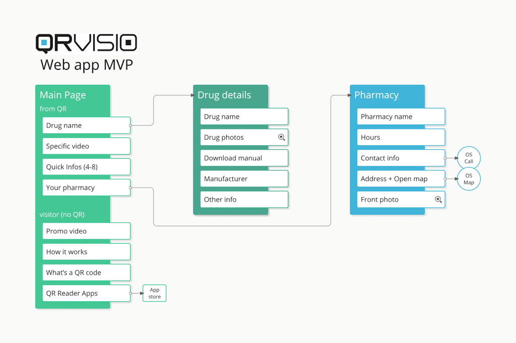
To ship an MVP and get feedback early on, I cut the map to a core that still simplified the leaflet and kept the patient–pharmacy link, and the explainer videos (watch a sample) still carried the reassurance patients wanted from a human. This let us drop the native app for a web app and remove the install barrier entirely.

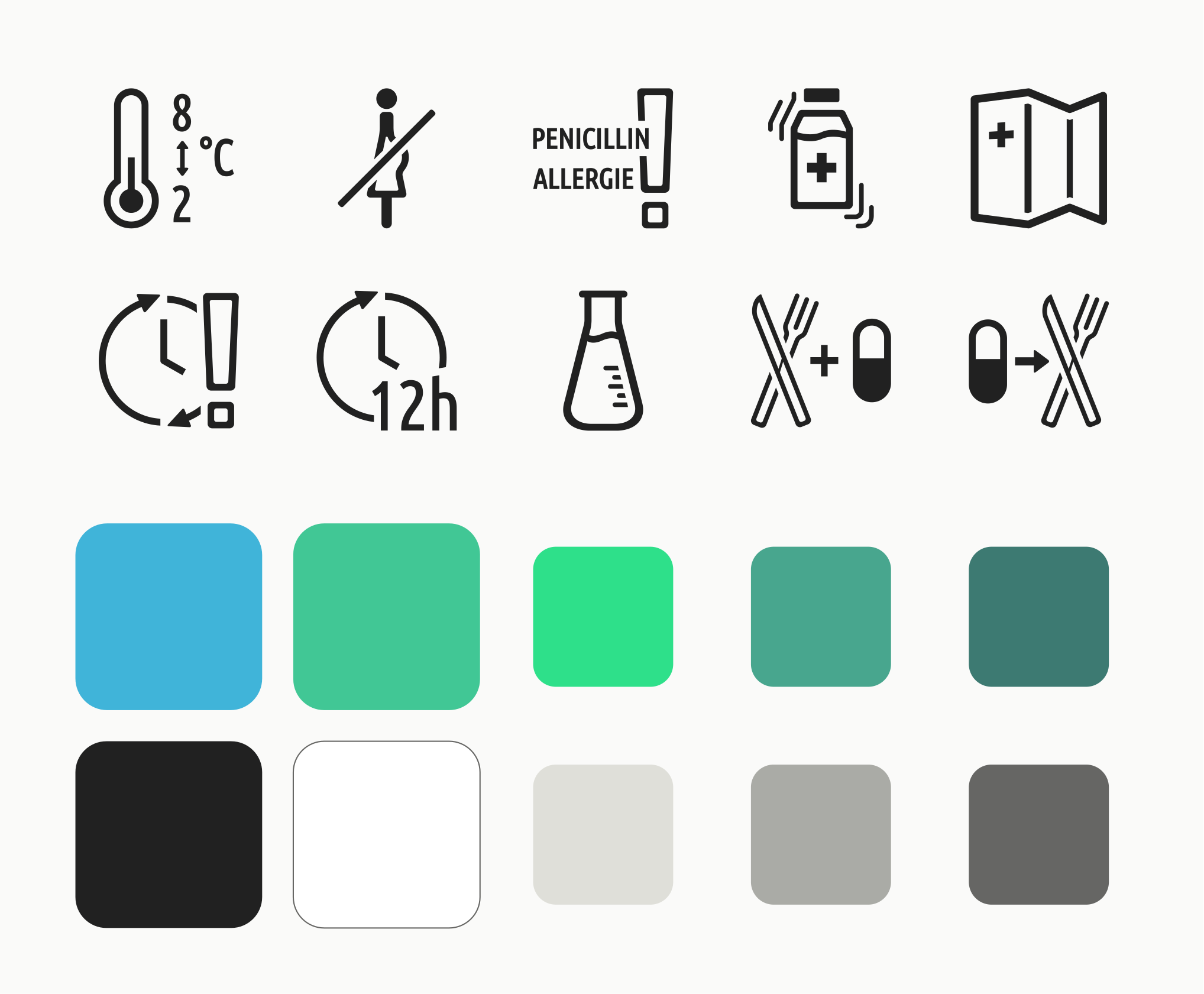
Stock icons were limited, and the ones available adapted badly to our needs, which called for marks for special cases like temperature and allergy warnings. Alongside the logo and branding, I drew a custom set from scratch, a sample is below. I was early in my career here, but it's a piece I'm quite proud of on this project: it's a set I'd still ship today.

WHAT I'D CHANGE TODAY
Some time later the project was shelved for funding, while we were still in the middle of acting on the feedback, iterating, and expanding the feature-set.
There are two things I'd certainly do differently today. First, proper persona and journey work, including a pharmacist stakeholder persona. Second, a separate accessibility mode for low-vision users rather than one layout stretched to fit everyone. The oversized touch targets, airy layout, and custom icon set, all built for shaky hands and tired eyes, I'd keep.